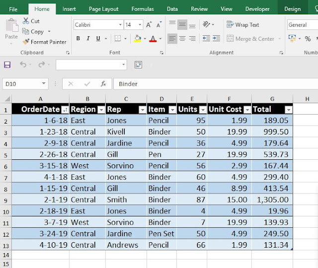
Download the table & working here
In simple word we are going to create some range to understand how different figures under the Total column fits in the different ranges. It is called 'Frequency Distribution'. This type of analysis is very useful.
Steps:
- Click inside the Data Table.
- Under the Insert Tab click Pivot Table.
- Select the table range if not selected.
- Highlight the radio button for New Worksheet.
- click ok.
- Drag the Total column under Values Area.
- Left Click on 'Sum of Total' (Total Field) under Value Area.
- Navigate down to 'Value Field Settings'.
- Change the Value Field to 'Count'.
- Again drag the Total field to Row area.
- Left Click inside the Pivot table on any Total Figure.
- Under Analyze Tab click 'Group Selection'.
- Starting & Ending figures are already incorporated, based on Highest and lowest. 'By' sets the distribution range. We can change it. But here we will proceed with 100 as default.
- Click Ok
Range difference is 100. Count column states the occurrence of different 'Total' values within different ranges.
Say between 519.96 to 619.96 there is only one occurrence. Check Table, i,e, Gill's performance under Central region 539.73 '


No comments:
Post a Comment